As UX Designers we’re fond of taking the “human-centered” approach, which involves bringing in the human perspective to all steps of the problem-solving process. Whether we are talking to customers or co-creating solutions with users, this frame of mind allows us to bring forth products and services that serve human needs and goals.
The thing is, the understanding two humans can reach in a matter of minutes is tough to replicate in digital products. No matter what any AI expert says, no commercial technology that exists today can substitute having a conversation with another human. And, no matter how human-centered we get, we’re still designing for bits and pixels. Digital products are still digital.
However, as UX Designers, we aim to design these digital places to meet human needs, goals, and motivations. The question we often ask ourselves is, can we make the digital worlds we design more human spaces?
The answer we’ve come up with is that we need to design experiences where the digital spaces shapeshift to approximate an in-person conversation to the best of their abilities (and without a chatbot) given the limitations of the medium.
So the question is: how close can we get the websites, products and services we design to have more of an “organic conversation” with the user?
Defining Organic Conversations Between Users And Businesses
What is an “organic conversation” between users and businesses in the context of a digital/online environment anyway?
Initially, businesses organized website navigation per department or line of business. As in: the business has these 5 departments, so these 5 departments will be at the top of our homepage. The assumption was – and often still is – that the business and the end-user of the site are 100% aligned on needs. That worked at first, mostly because customers had low expectations as they were learning how to use the internet. There wasn’t much competition for their attention, nor a public platform to log their complaints.
Over the years, people’s online usage patterns have changed. Partly because we’ve done our job so well, customers have come to expect businesses to behave more “human.” In other words, customers expect to find anything they need on a website as easily as asking an in-store customer service rep. And, they expect to be able to meet their needs from anywhere on the site/app, not just from the hamburger menu or the main nav bar at the top.
In the context of the expectation that digital properties should behave in a more “human” way, we define an “organic conversation” as one that naturally flows between the customer and brand in whatever digital medium they meet. We also believe an “organic conversation” is created by designing intent-based navigation through a process we call Designing for Customer Intentions. This can only happen if we understand, document, and design for what customers intend to do when interacting with a digital medium, as opposed to designing for the content businesses have in their storehouse. In other words, we ask the question “What tasks does a customer aim to complete when coming to the website, or when using a product or service?” Then we design the navigation to fill in the answers.
Navigation As The Organic Conversation Starter
Before we get into the details of how to design a navigational structure around customer intentions, let’s pause for a moment to consider navigation itself.
Navigation is an important, yet underrated structure of a digital property. Today’s navigational structures are usually a combination of top-level navigation (i.e. those links at the top of the “homepage” or in the “hamburger” menu) and some form of on-page navigation with related content. But, ubiquitous concepts have a tendency to get stale over time.
Navigation could be, and needs to be, so much more.
If we take a step back and think about navigation as an organic conversation between the digital property and the user, then navigation becomes a bridge that facilitates human communication. In this role, navigation takes on new meaning in the context of design. It becomes the means by which a digital property can have an “organic conversation” with its user.
The Main Idea
Taking all this into account, we need to think of navigation as more than hierarchy (i.e. a per department/line of business) and recommended next steps. In conjunction with a sound hierarchy, we need to create lateral, intentions-based navigation structures that foster the “organic conversations” between a brand and its customers.
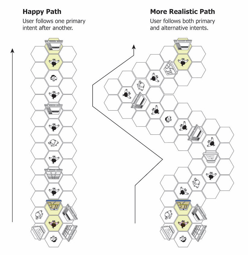
Our idea of intent-based navigation has roots in both Pervasive Information Architecture and Dan Willis’ Intent Paths graphic below.

This graphic represents paths people can use to navigate software applications or websites. The hexagons represent a place on a digital property (i.e. a web page for example). The person in the middle of the hexagon has several paths (i.e. links on a web page) they could take to get to the next place.
On the left-hand side, we see an example of a customer path often defined on software projects. If you’ve been on a software project before, you’ll recognize this as The Happy Path.
The Happy Path assumes the user has a singular task, and once they start down a path, the user is completely focused on his or her task. There are no distractions, questions, or thoughts that the user has while on this path.
Too many navigations are built in this very linear way to ensure the customer is forced down the happy path. Unfortunately, this method misses the mark in real life, and it certainly doesn’t foster an organic conversation that flows.
To a user or customer, limiting path options to very linear, Happy Path thinking, feels more like a business telling them where they should go and less like the business supporting them in where they intend or want to go.
As a result, forced linear navigation can decrease a user’s intrinsic motivation (defined as doing something without any obvious external rewards), by decreasing:
- Competence, or the desire to control and master whatever online environment you’re in and its outcome
- Autonomy, or the desire for exercising your free will
Now, let’s look at the right-hand hexagon diagram, the more Realistic Path.
In this example, a user walks through a Happy Path door, but then decides to take a right. Immediately, their environment shifts to support them in meeting their intention.
By taking a right, the user has given the system a clue about their intention for visiting. With the more Realistic Path, it doesn’t matter if they stay on the Happy Path or not, the navigational path shapeshifts and customizes to their actions so there are no navigational “mistakes” to recover from.
The idea of a digital ecosystem taking into account what a user is selecting and cultivating a digital interface based on that, increases competence and autonomy, thereby increasing intrinsic motivation. The ability for the ecosystem to shapeshift relies on a sound information structure modeled off fulfilling customer intentions.
Designing Navigation Around Customer Intentions
If we design digital navigation structures that empower the Realistic Path, we’ll be creating that human, organic conversation and empowering customers to fulfill their intentions on a digital property.
This, in turn, would increase customers’ intrinsic motivation, making them more happy and loyal, and ultimately making the business profitable.
Additionally, lateral, intent-based navigations support:
- customer experience – a person’s perception of a brand – which is everything when it comes to customer monetization and retention. It’s the intangible value on a balance sheet. Their goodwill.
- findability – the ease with which information can be found – improves when the customer is able to navigate a site or product according to what they need, NOT according to the happy path the business projects.
- delight – the unexpected magic of “how did they know I was looking for that?” – is the X-factor most businesses lack. It’s the differentiator in today’s competitive marketplace. Creating this delight is easier than you think when you know what someone’s intentions are and you design your information structure to support meeting those intentions.
- customer loyalty – with enough repeat, organic, delightful interactions over time, customer loyalty – a.k.a. the holy grail – improves to such an extent that the T in your SWOT analysis loses its importance. Competition can’t compete when company values meet the customers’ values.
It’s important to remember: Navigation is not just about “the navigation bar,” or that “hamburger menu.” It’s also not about company departments, lines of business, or company politics. Frankly, it’s not even about products and services. Navigation is about servicing what the customer wants to do on a website or in a product, otherwise known as customer intention(s).
By designing your information structure to meet customer intentions you’re designing an organic flow. You’re helping customers meet information based on how they think, what they need, and what they intend to do, rather than how your business is structured. You’re also not forcing the user to “navigate” your hierarchy, rather you help them explore based on what they need. This allows for organic conversation to emerge.
Part 2 of this article will dive into the method illustrated by a real-world example (generalized for client benefit) of putting it to use in an e-commerce website redesign project.
Information Architecture Super Guide
Complete Beginner’s Guide to Information Architecture
Information architecture is an often misunderstood job title. Are they designers? developers? managers? All of the above? In this article we’ll discuss what information architecture is, why it’s related to usability, and what are the common tools/programs used in information architecture.
`


